Find the surface that dominates
A plain room is not always short of colour. It may contain several large surfaces that feel much the same: a smooth sofa, smooth curtains, a shiny table and a flat rug. Stand at the entrance and identify what occupies most of the view. Changing the texture of one substantial element can be more effective than scattering small decorative objects around its edges.
Keep the room's ordinary use in mind. A living room needs surfaces that welcome sitting, putting down a cup and opening the curtains. Texture should not turn those activities into careful negotiations. Before buying anything, touch the textiles you already own and consider whether a throw, cushion or rug could do a better job in this particular room.
Choose a contrast you can feel
Pairing a loosely woven cushion with a smooth upholstered chair makes both easier to notice. A matte ceramic bowl on a polished table has a similar effect. You do not need a strict formula; look for a difference that remains visible from across the room. Tiny variations between several beige fabrics may disappear unless you are standing directly beside them.
Use colour to keep those contrasts calm. Related shades allow the surface qualities to become the interesting part, while a stronger colour can draw attention to a single texture. If a room already has a bold pattern, choose quieter textured pieces around it so the eye has somewhere to rest. Adding variety does not require every object to demand attention.
Consider the practical side of softness
A thick rug can make a seating area feel more comfortable, but its height needs to suit doors, furniture and anyone moving through the room. Check the backing and whether a suitable underlay is required for the floor. Avoid placing a small loose rug exactly where people turn, particularly when it could slide or catch a foot.
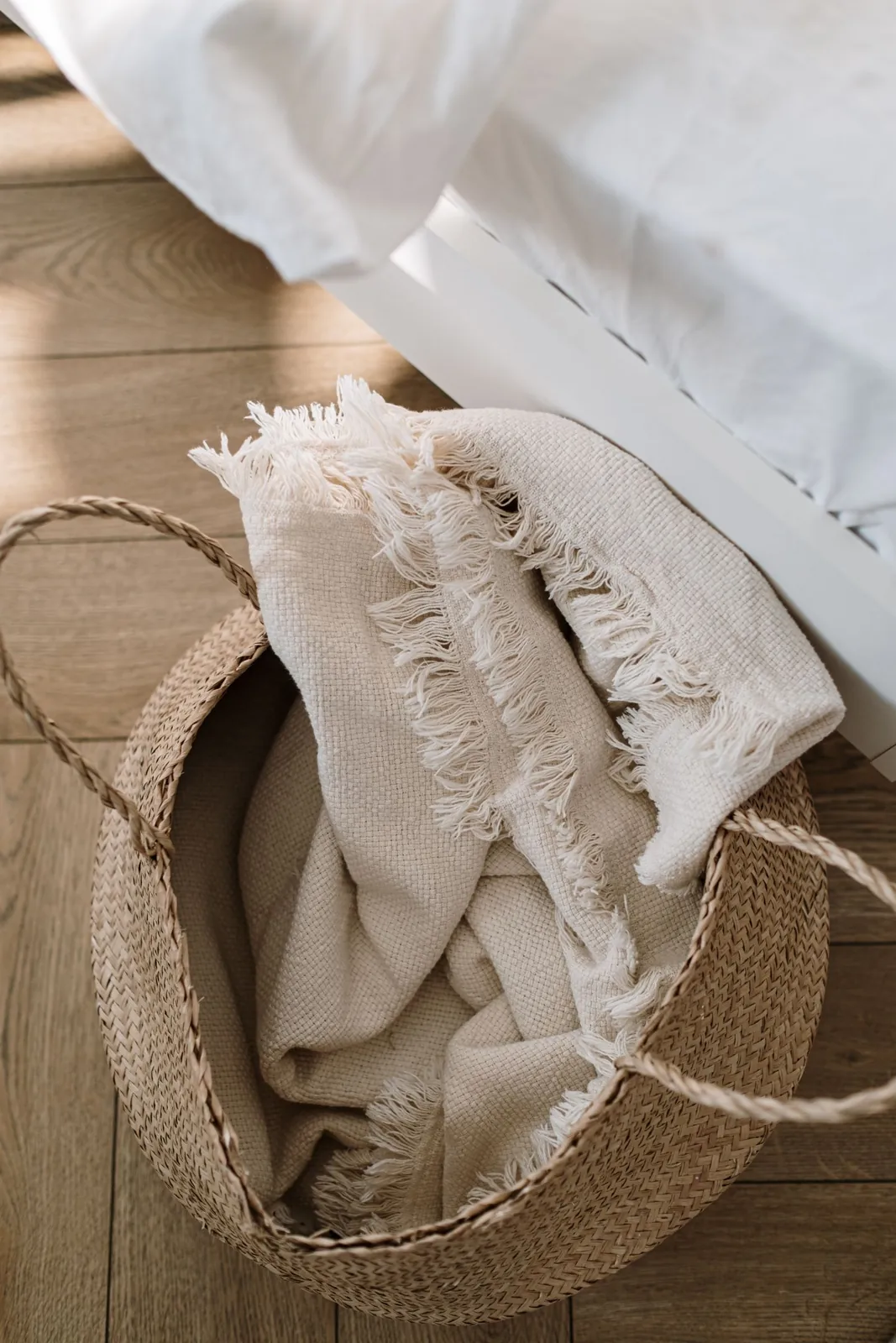
Throws and cushions also need realistic care. A delicate woven cover may be enjoyable on an occasional chair but frustrating on the family's most-used sofa. Read cleaning instructions and inspect closures, loose threads and the feel against bare skin. Something that looks wonderfully soft online can be scratchy in use, so samples or a clear returns policy are helpful.
Let harder materials contribute
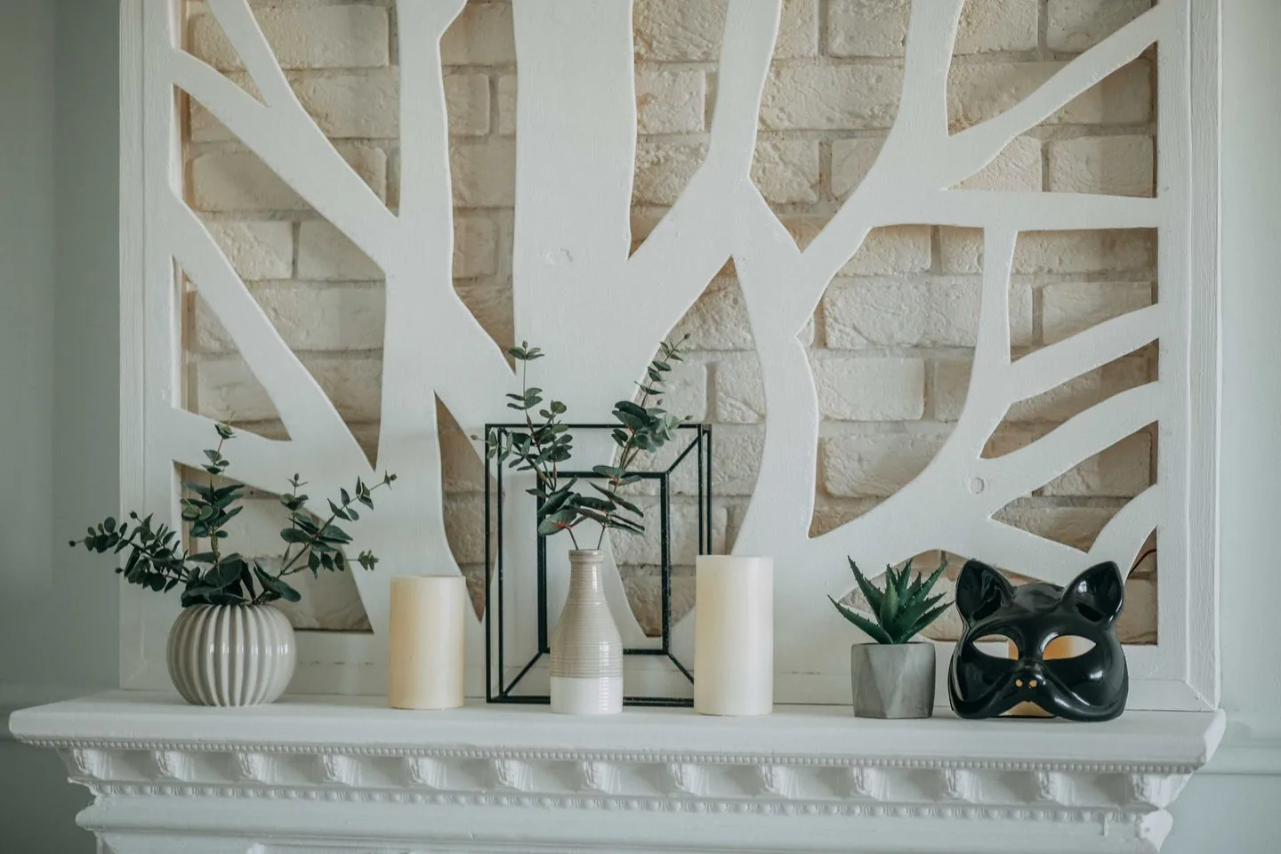
Texture is not limited to fabric. Timber grain, ribbed glass, woven baskets and unglazed-looking pottery can bring variety to a quiet room. Choose pieces with an actual role, such as a basket that fits the blankets or a tray that steadies drinks on an ottoman. Their usefulness helps the room remain uncluttered as the visual detail increases.
Be careful around moisture and heat. A porous decorative surface may need protection from a plant pot, while a rough base can mark furniture. Check what the object is designed to do instead of assuming a pleasing material is suitable for every purpose. Often a discreet liner or protective pad solves the issue without changing the appearance.
Stop when the room has enough depth
After introducing one or two changes, live with them before adding another layer. Look at the room in daylight and under lamps, when raised weaves and uneven surfaces cast different shadows. If it now feels more inviting, leave some plain areas alone. The contrast between quiet space and tactile detail is what gives the additions their effect.
Texture works best when it changes how a room feels as well as how it photographs.
A Swishover guide · Practical ideas to adapt to your own home.
Spotted something we should improve?