Choose a cushion with useful colours
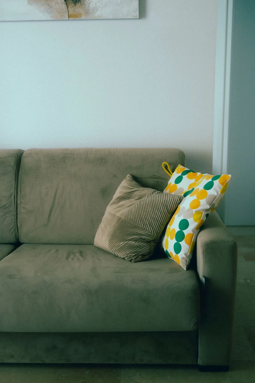
A cushion can offer a ready-made relationship between colours, especially when its pattern contains several tones you already enjoy. Choose one that belongs comfortably with the room's fixed elements, such as flooring, large upholstery and cabinetry. It should be a helpful reference rather than an object that forces every other decision. Look at it in the room's daylight and evening light before building a palette around it.
If the cushion contains many colours, identify just a few that matter most. Notice the background, the larger shapes and any small accent. These occupy different amounts of the pattern, and they do not all need equal representation across the room. Taking every colour literally can make a modest starting point unexpectedly busy.
Find the quiet foundation
The cushion's background often suggests a useful foundation, but it need not become the wall colour. A warm cream might connect to existing curtains, or a soft grey-green could appear in a plain throw. Compare the tone with the sofa and floor so that the relationship feels deliberate. A near match that looks accidental may be less satisfying than a clearly related lighter or darker shade.
Keep large decisions proportionate. If the room already has a suitable wall colour, use it as part of the palette rather than repainting solely because the cushion contains another neutral. The aim is to connect what is there, not create a shopping list for a completely new room.
Repeat an accent in small amounts
Choose one accent from the cushion and try it in a modest object elsewhere: a lampshade, a ceramic bowl or another textile. The repeated colour can guide the eye through the room without appearing on every surface. Different materials will reflect light differently, so exact matches are neither always possible nor necessary. A rusty orange in woven fabric may relate well to a glazed pot with more variation in its finish.
Avoid spreading the accent evenly like markers around the room. Let some areas remain quiet, and place the colour where the object is useful or meaningful. Repetition works best when it feels connected to the room's activities rather than added only to demonstrate the palette.
Vary pattern and texture
The starting cushion can remain the main pattern while other pieces offer quieter textures. A plain weave, subtle stripe or natural timber may add interest without competing with it. If adding another pattern, consider both its scale and its contrast. Two equally bold patterns in similar sizes can be harder to distinguish than a large motif beside a fine stripe.
Use existing books, artwork and plants as part of the colour picture too. They do not need to be recoloured or hidden because they fall outside a rigid scheme. A room is more comfortable when the palette provides a loose relationship among real belongings, leaving room for personal objects with their own colours.
Test before committing to larger changes
Bring small samples together near the sofa and look at them at different times of day. Move them farther apart to see whether the connection remains readable across the room. A paint chip viewed against the cushion at close range may behave differently on a full wall. Use an appropriately sized paint sample if painting becomes part of the plan.
Add one change at a time and stop when the room feels connected. The cushion does not have to remain forever for the palette to work; the resulting relationships can stand on their own. Keeping that flexibility makes future changes easier and prevents one small accessory from becoming an unnecessarily strict design rule.
Choose a quiet foundation and one or two accents from the cushion, then repeat them loosely across useful objects.
A Swishover guide · Practical ideas to adapt to your own home.
Spotted something we should improve?