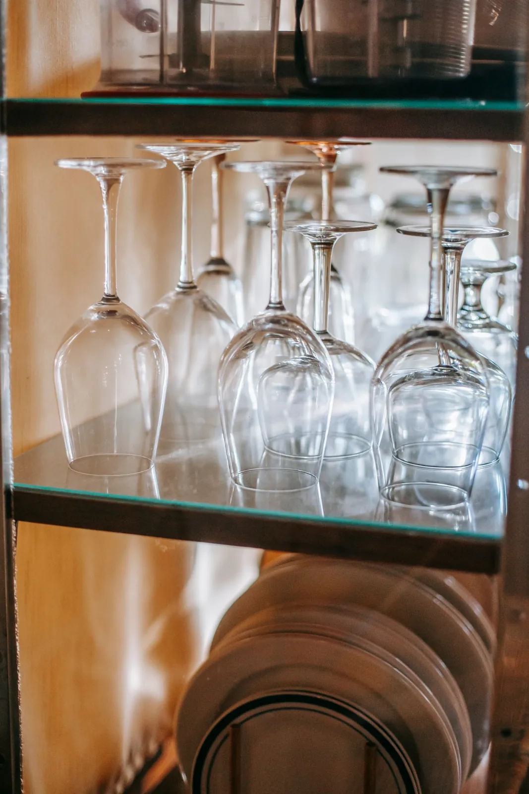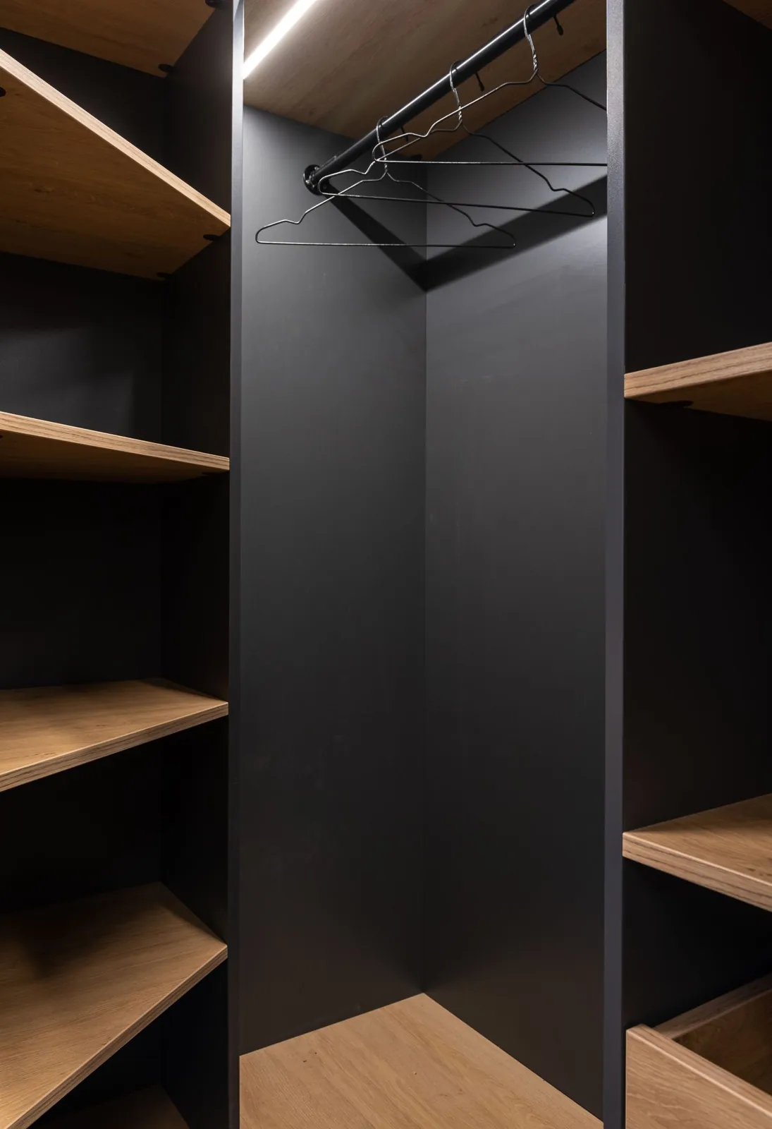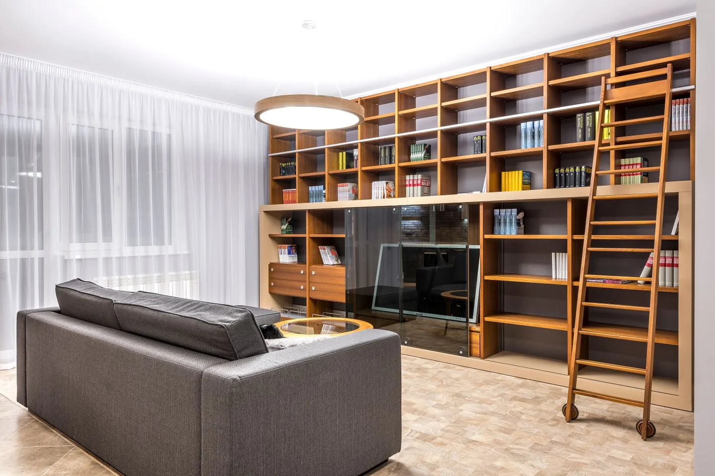
Read the whole wall first
Stand at the room's main entrance and look at the storage as one shape. A wall can feel heavy because it is dark, because every shelf is full or because many small objects create a restless pattern. Those problems need different responses. Before changing furniture, remove temporary items from the top and check whether the outline becomes calmer. A row of boxes above a cupboard can make an otherwise simple unit feel unfinished and crowded. Decide which parts need to be visually quiet and which can show objects. There is no need to expose everything simply because open shelving appears lighter in an empty photograph.
Simplify the visible rhythm
Repeated door sizes, consistent handles and a limited range of finishes can help a large unit read as a coherent background. If you are working with existing furniture, small changes such as aligning handles or grouping similar containers may be enough. Do not alter structural parts or remove fittings without checking the furniture instructions. With modular pieces, a deliberate arrangement often looks calmer than several unrelated heights accidentally meeting.
Keep the furniture's function clear. A large closed section can hold visually busy possessions while a smaller open section contains books or a few useful objects. Too many tiny display compartments may increase visual activity even when each one is sparsely filled.
Use colour with the room
A finish close to the surrounding wall can soften the unit's outline, while a darker colour may give it a more deliberate presence. Neither approach automatically makes a room larger. Consider daylight, flooring and neighbouring furniture before deciding. If painting is suitable for the material, prepare and finish it according to the product instructions and test the colour in the room. Changing only one component can sometimes make an existing wall feel disjointed, so view a sample beside doors, handles and shelves before committing to the full surface.
Leave openings that have a purpose
An open niche can provide a place for a lamp, a bowl or books currently in use. Keep it large enough to be useful rather than carving many small gaps into the storage. Where lighting is involved, use an appropriate installation and preserve the equipment's clearances; do not hide cables or heat-producing fittings in unsuitable enclosed spaces.
A little uncovered shelf helps the eye distinguish groups. That does not mean emptying useful storage purely for appearance. Move loose small belongings into suitable closed compartments first, then see where natural gaps remain. The display should emerge from what belongs in the room, rather than from buying objects to fill planned decorative spaces.
Protect the floor and the route
Storage can dominate because it projects into the room, not just because of its colour. Keep the walking route clear and check door and drawer opening space. Avoid adding a second layer of baskets along the floor in front. Where a unit has visible legs, keep the space beneath clean and unobstructed so its lighter outline remains apparent. Do not remove a plinth or lift furniture onto improvised feet to imitate that look. Stability, load limits and anchoring remain essential. Finish by checking the room from seated height: the wall should provide a calm backdrop while keeping its most useful contents within comfortable reach.
Calm the outline, contain visually busy items and let a few useful openings provide relief.
A Swishover guide · Practical ideas to adapt to your own home.
Spotted something we should improve?